Step 1: The image
You need an image to edit, preferably of somebody holding something saber-ish, a sword, a stick. Or perhaps a fully-fledged lightsaber prop? Or something similar such as a Force-FX saber or just a hilt.
Google can do your thing, but watch out for copyrights.
Step 2: The core effect
Now that you have got your image, it's time to start the effect. We begin by painting the core. That's the white blade in the middle. If you have a stick or a prop, use the line tool to cover it with white, or if you are in a self-destructive mood or have drawing specialised input tools, use the paintbrush.

If you have no stick you can use the hilt or your empty hands as a guide, remember, lightsaber blades are roughly one meter long.
Make sure the line extends at least a little over the hilt or hands, then use the eraser to adjust it so it matches up with the emitter hole just nicely.

Then use the paintbrush to round the other end. A flat saber is simply so boring.

If the stick or imaginary so is obstructed by anything so should the core be, erase.
The core is more important than you might think, a well made core greatly contributes to the 3D-effect that makes the saber look like it's there.
Step 3: The glow
Now, for the thing that makes the saber look bright and deadly, the glow.
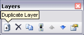
Duplicate the core thrice;

set the layers to screen, I have found this looks very similar to real photographic glows;

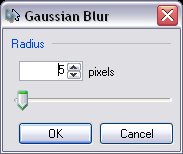
Now use gaussian blur on each of the layers in incremental values. Like for example: 10, 20, 30. Or 10, 20, 40.


It depends on what kind of glow you want. The amount of blur also depends on the size of the image.
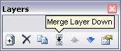
Now merge the layers.

Step 4: The colour
The saber needs colour now. A white saber is simply so boring. The choice of colour is a good start. Remember, canonically there's only four colours. Red = bad. Blue & green = good. And then purple, for awesome.
But the expanded universe gives you the option for any colour you like, be it hot pink or rainbow gradient. Although I won't detail how to do the latter here.
You can apply the colour in two ways. By using levels, and by using recolour.
Levels: Open levels and adjust the colour sliders for the glow layer until it has the hue you want, some interesting and glow-ish effects can be achieved with this.
Recolour: I like this because it gives me better control over the hue, and I can always use levels after that, but thats just me. Select the colour you want for primary, and white for secondary. Use 100 px brush to go over the entire glow.
You're pretty much done now. But there's some finishing, although optional touches that can really make the saber better.
Step 5: The light
Lightsabers, are as the name suggest, lightsources. You may want to add "Interactive Lighting". Force FX sabers light up, so they pretty much do the job for you, but you may want to enhance the effect as it isn't quite bright enough for a lightsaber. Or you can add additional light when you take the photo with lamps.
For digitally making the effect:
Make a new layer, use a tinted brush to paint a not-too-thick line or dot on the surfaces you want lit. Use much gaussian blur. you may want to make several layers for surfaces that aren't parralel or need different amounts of light. You may also want to expand the canvas considerably for the next procedure.
Make selection boxes around the entire blurred lines and dots and use rotate/zoom to give them proper perspective.
Then use the eraser to go over the places that wouldn't receive light, such as the background behind a person or object, or on the shadow side of things, or maybe some things are shaded by another object?
Merge your light layers.
Duplicate it, then set the lower layer to overlay, and the upper to reflect. Make the reflect layer of limited opacity.
If the image has very dark areas you may want to use yet another layer to make a light foundation with screen. Again, with limited opacity.
Step 6: The reflections
Now, bright stuff reflect very visibly. Your forceFX may have left guide reflections or maybe your stick blatantly shows up? Anyways paint reflections with a tinted brush, then a smaller white one. Set the layer to... you guessed it, reflect. Again, of limited opacity.
If there's a big mirror you may want to make an entirely new saber effect for it instead.
Step 7: The adjustments
The final touches.
I like to make yet another glow that is very small and completely white, and only one duplication. It gives the saber an extra sense of brightness.
Make sure the layers are layered like this:
Small glow
Glow
Core
Interactive light reflect
Interactive light overlay
Interactive light screen
Reflections
Background
You may also want to adjust all the layers opacity settings so everything looks exactly perfect.
The idea of a saber glow is usually that it's perfect, artifactless. But you may want to add artifacts anyways. Duplicate the glow several times and move the dupes along an imaginary 3d-line of varying sizes and intensity.
You could also duplicate the core and stretch it with motion blur, of limited opacity.
If the image is old or of low quality you may want to adjust your saber equally. say, the image lacks contrast? The core probably shouldn't be pure white. Find the image's pure white and apply it to the core.
Is it grainy? Saber not excused. Apply grain. Etc, etc.
Remember when you initially make your saber effect to take into account the lighting conditions of the image, if it's dark the saber should appear very bright, if the sun is in the shot... probably not quite so.
If you have followed all the steps, you are very dedicated and now should have a very fine saber effect.
But mostly you'll probably just want to stick with the first 4 steps. There's not many who cares for all the mostly unnessecary extra work. But if you do happen to care...
But remember, don't slavishly follow a tutorial, everybody has their own idea of lightsabers, find yours. Stick to it.


 *
*


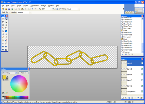
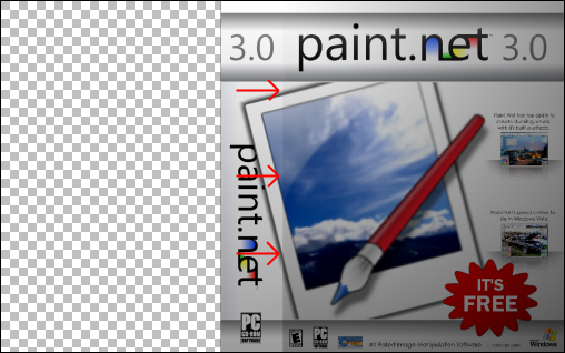
 and open the image in which you want to make the background transparent.
 and set the Tolerance level to 25% (or anything depending on your image. I would recommend 25% for sprites/pixel images.). Click somewhere on the background.
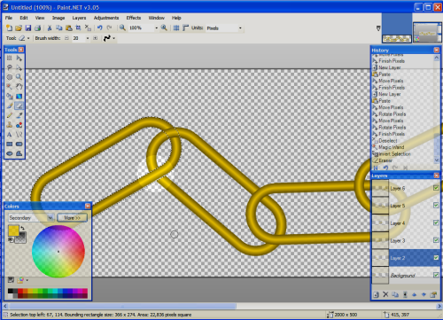
 You should see a "checkerboard" pattern where the image is now transparent.